Back
★★★★★ Trusted by 300+ clients
Top rated

Brand Identity — From Idea to System

1 week

Logo & Branding pack

Step 1: Exploration

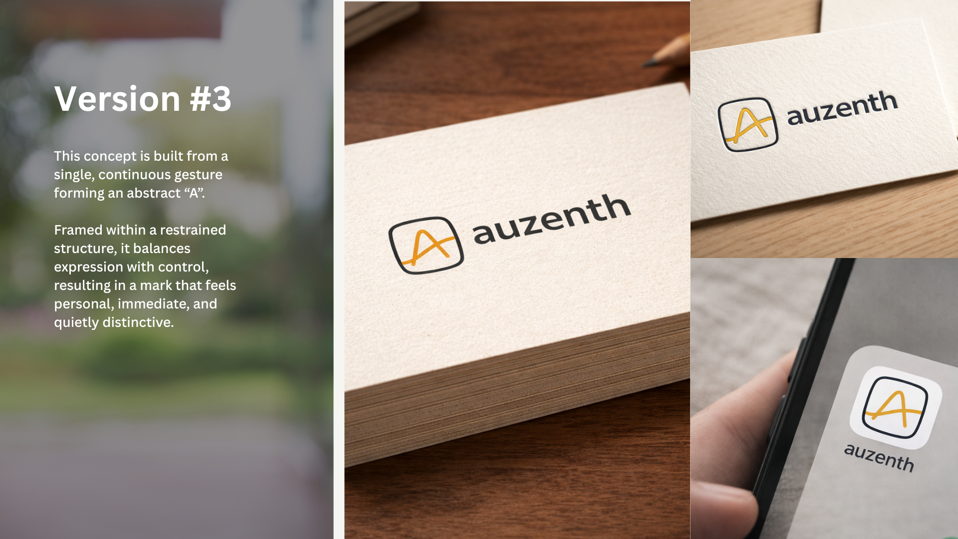
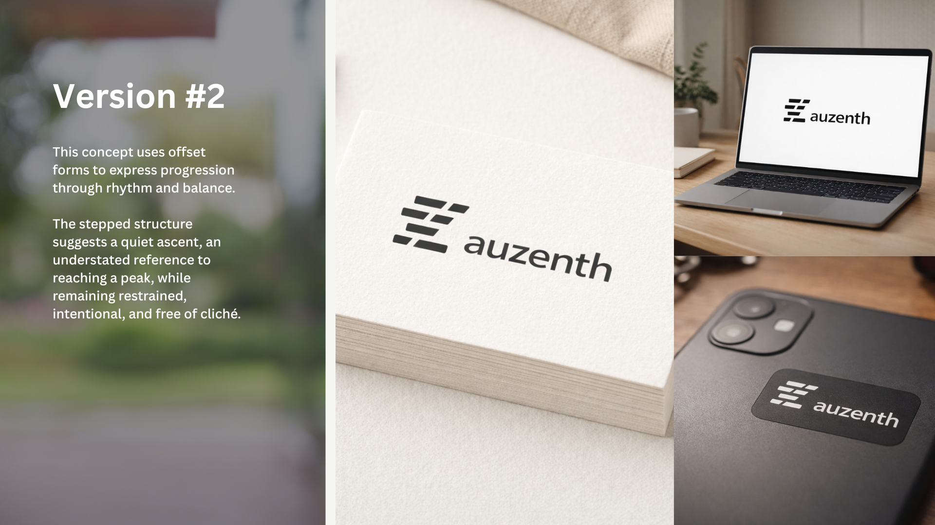
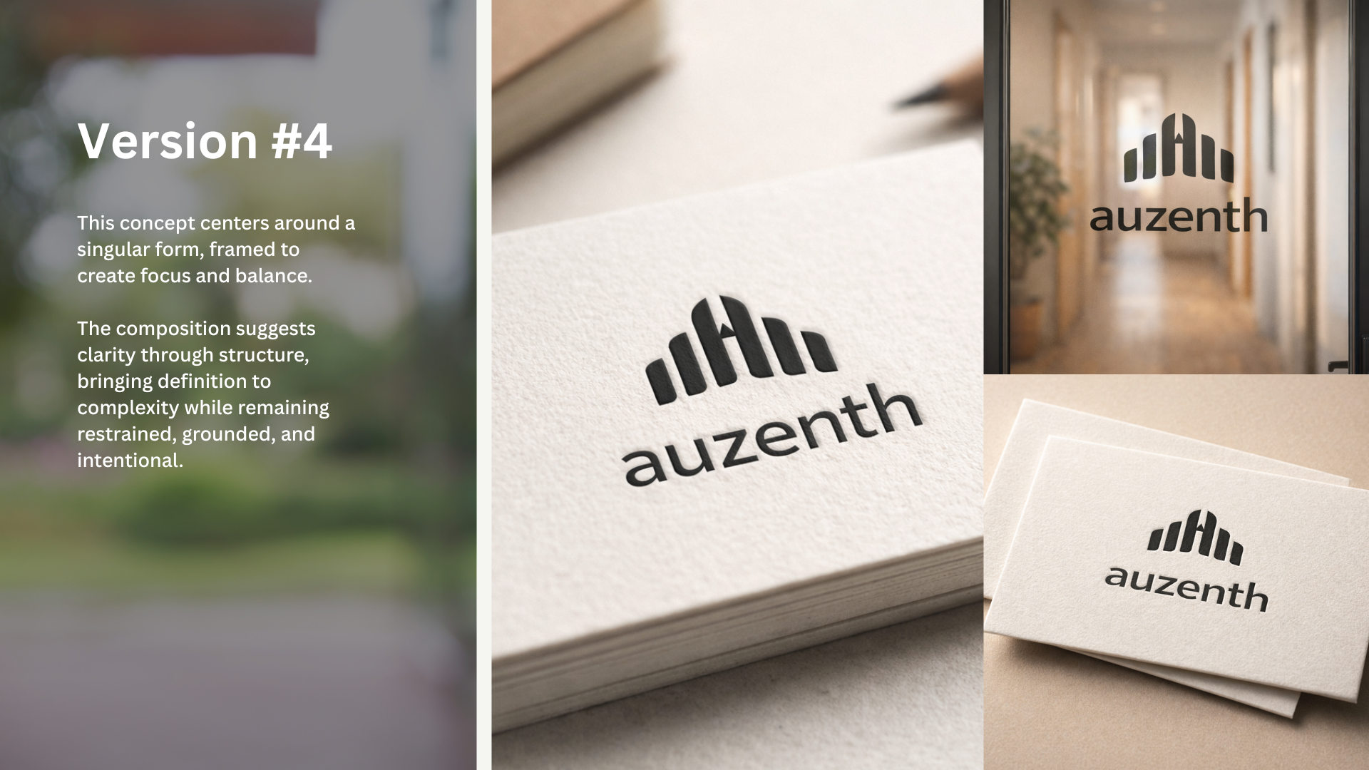
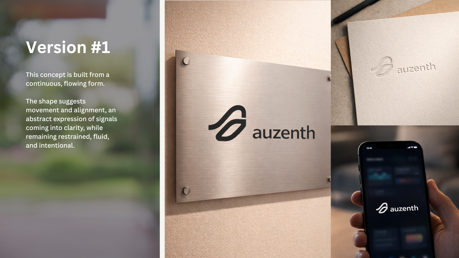
Five distinct directions were developed — each built around a different idea of what Auzenth could be.


Not variations, but genuinely different approaches to the brand.


The client responded immediately: the block structure of Version 2 and the upward gesture of Version 3 had the most potential.

Step 2: Symbol Exploration

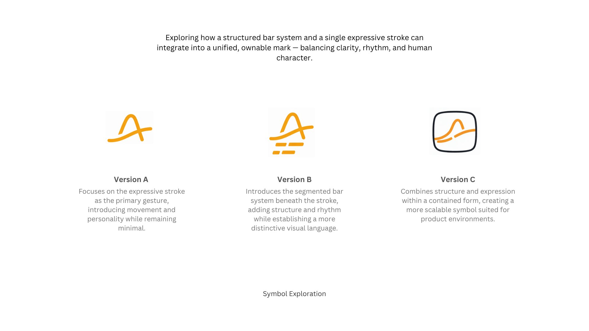
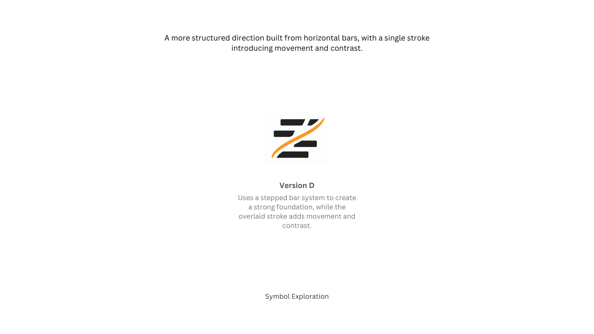
The block system was evolved — exploring how a structured bar language could carry an expressive stroke.


Four directions were developed: from expressive gestures (A, B, C) to a more structured stepped system (D).


The strongest directions were shortlisted for the next round.

Step 3: Typography

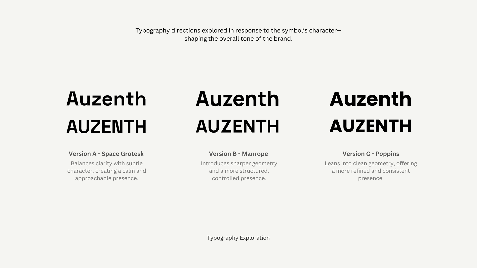
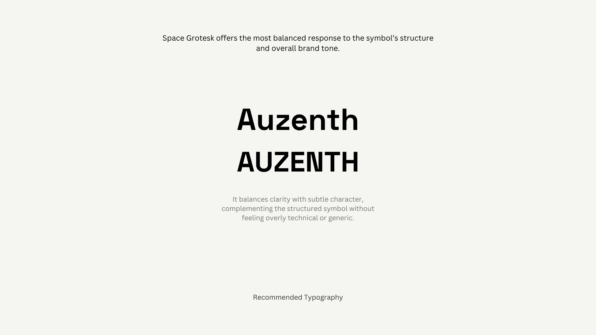
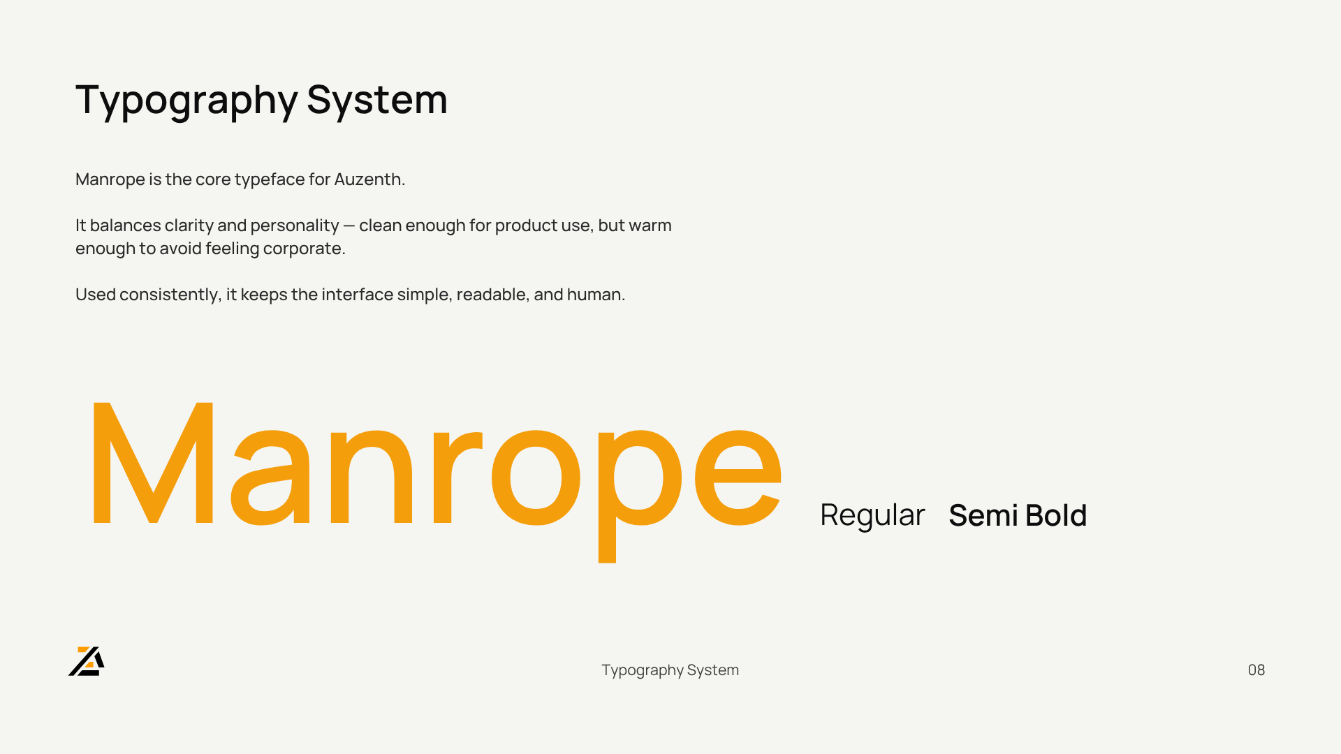
Three typefaces were tested to find the right voice for the wordmark: Space Grotesk, Manrope, and Poppins.


Manrope was chosen — sharper geometry, controlled presence, warm enough not to feel corporate.

Step 4: Symbol Validation

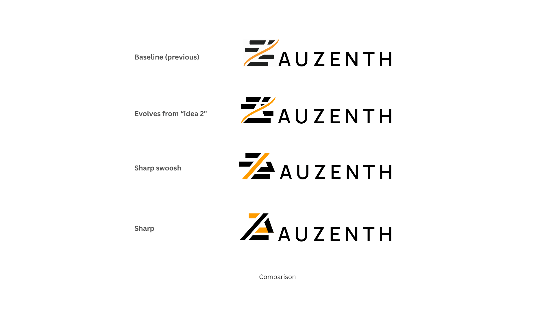
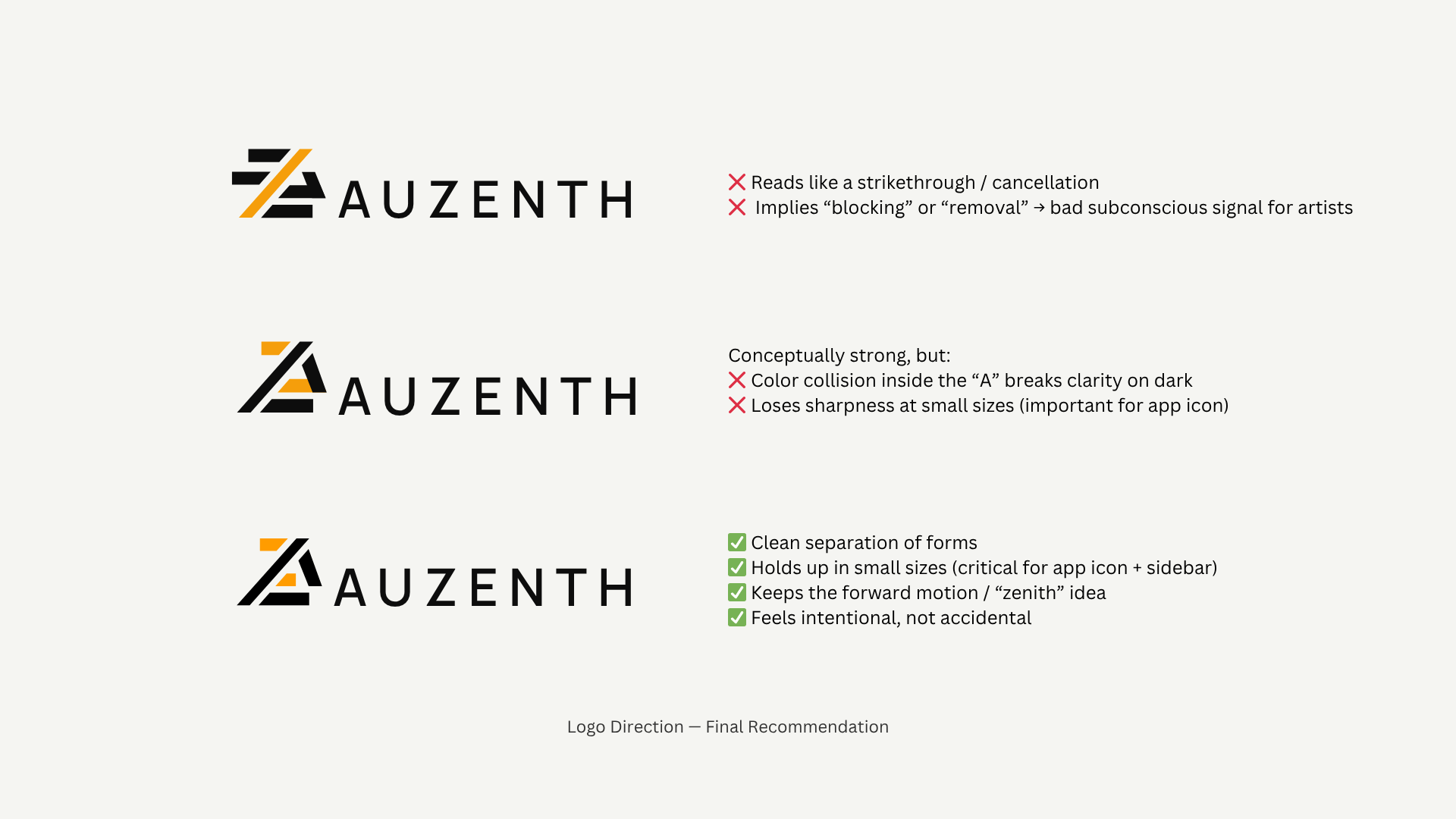
The curved stroke felt arbitrary against the geometric bars.

A full comparison was laid out: Baseline → Evolves from idea 2 → Sharp swoosh → Sharp. The evolution is visible — the direction was clear.

Three final symbol candidates were presented with annotations — each showing exactly why it works or doesn’t.

Step 5: Color Exploration

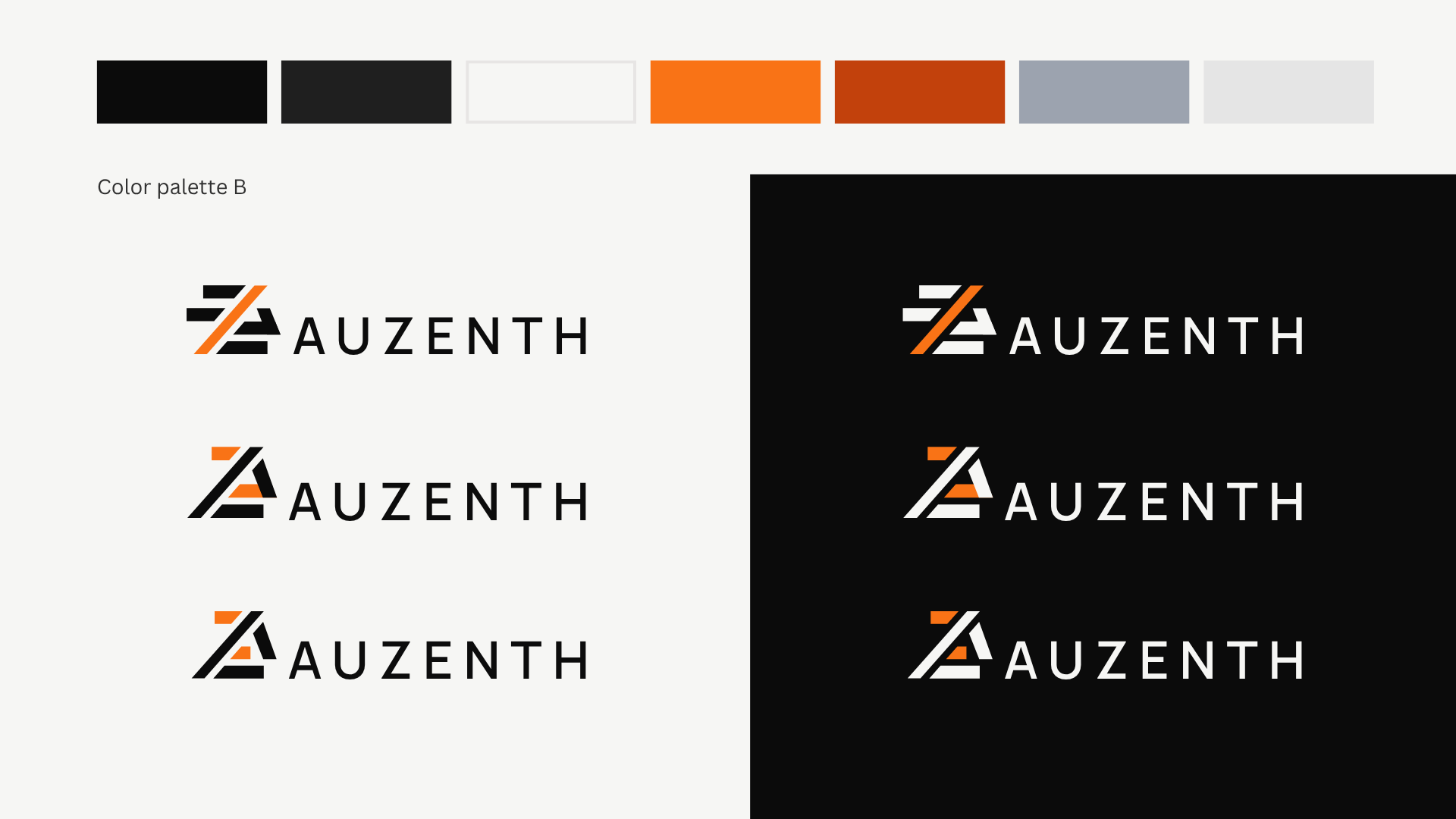
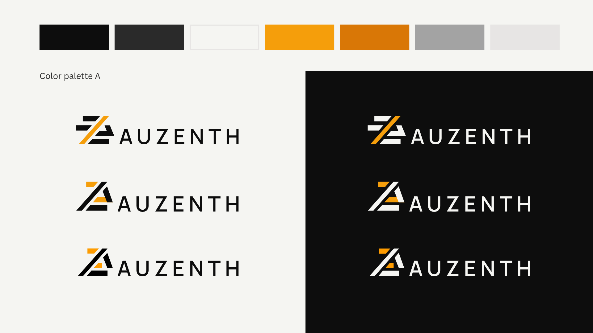
Two palette directions were compared: Gold — premium, stable, authority — and Orange — warm, energetic, approachable.


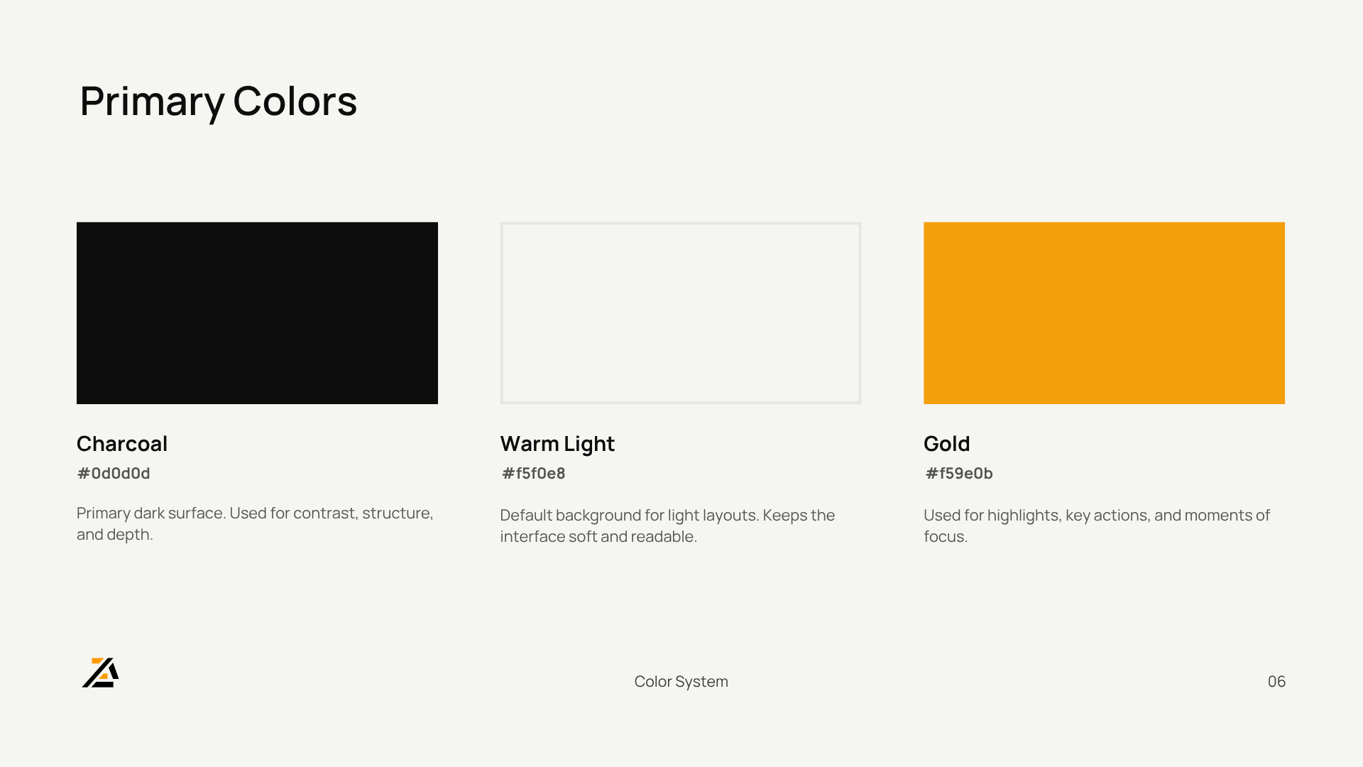
Both were tested across light and dark surfaces with the final symbol. Gold was chosen: it aligns with the “going gold” concept and supports the brand’s long-term positioning.

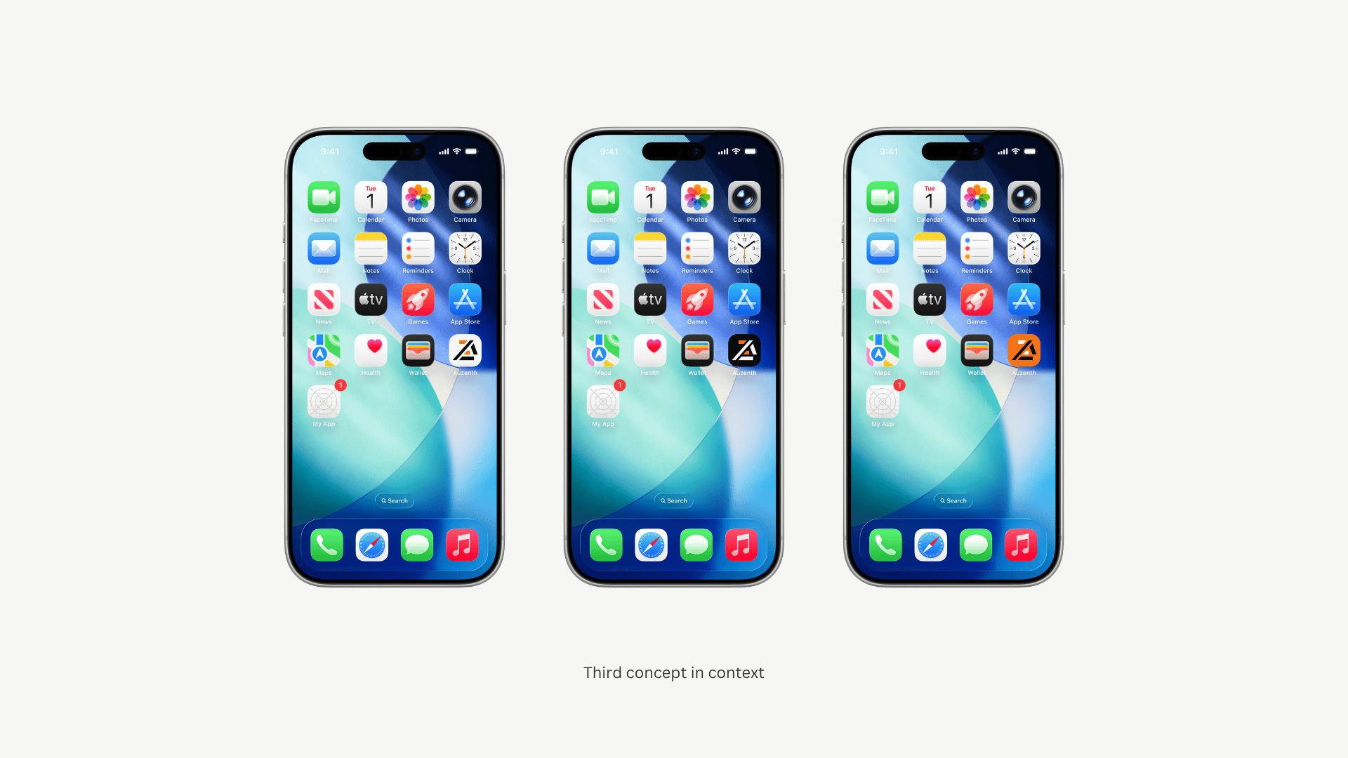
Step 6: App icon in Context

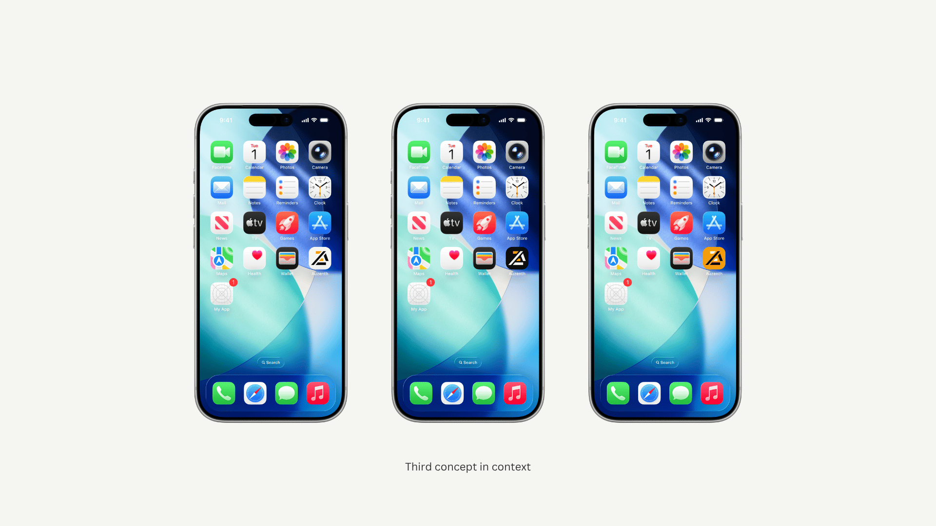
The symbol was tested as a real app icon across phone home screens — both color directions, light and dark.


A light background was recommended: better contrast, stronger recognition at small sizes, more visible in the App Store.

Step 7: Final Validation

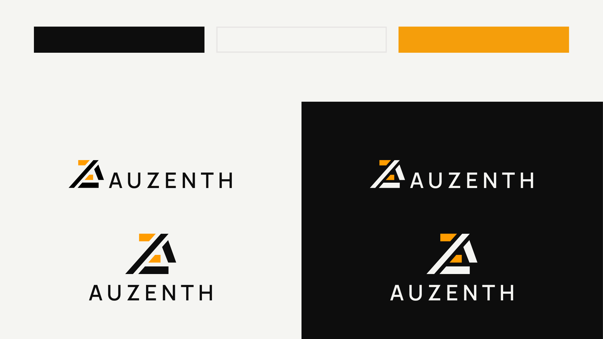
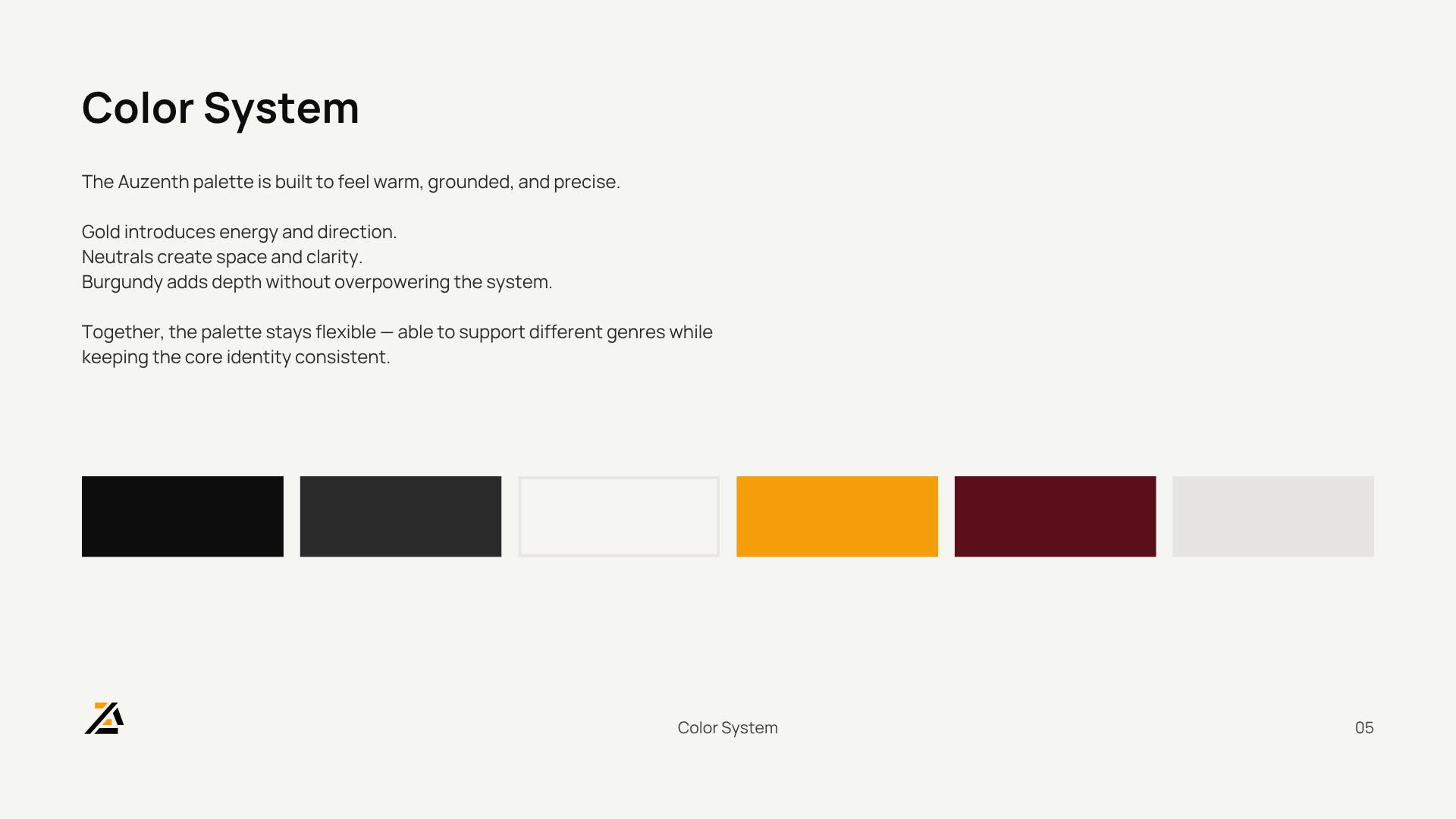
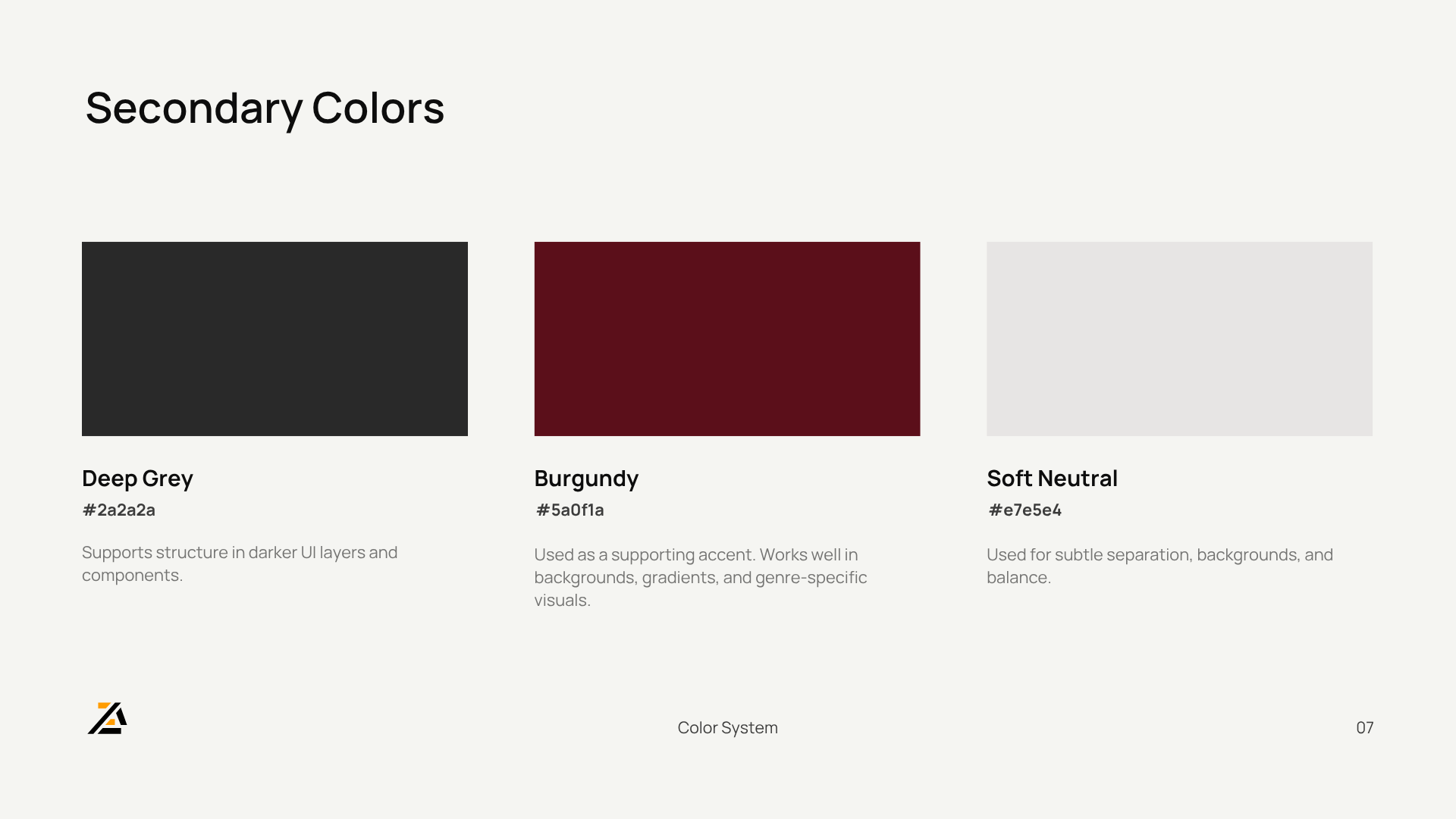
Burgundy was introduced as a secondary accent for genre-specific UI — present in the palette but not in the core logo.


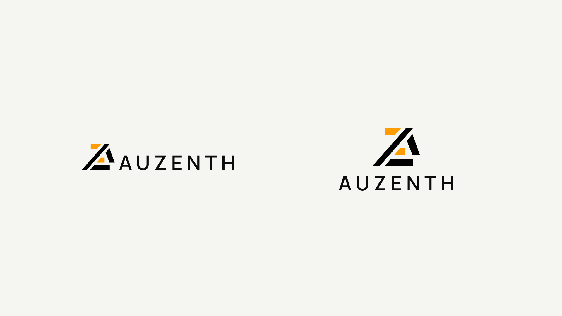
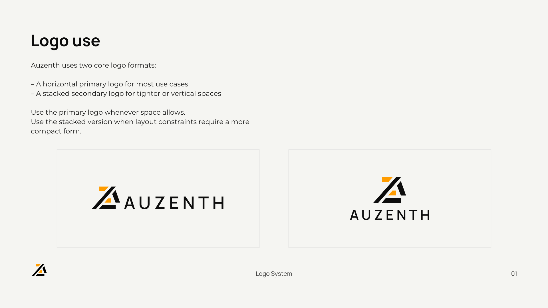
A stacked secondary logo was added for tighter contexts. Six colors, two lockups, everything validated across surfaces. The client approved.

Step 8: Outcome

Thirteen steps across seven days. Every decision driven by a specific reason — not a vague feeling.


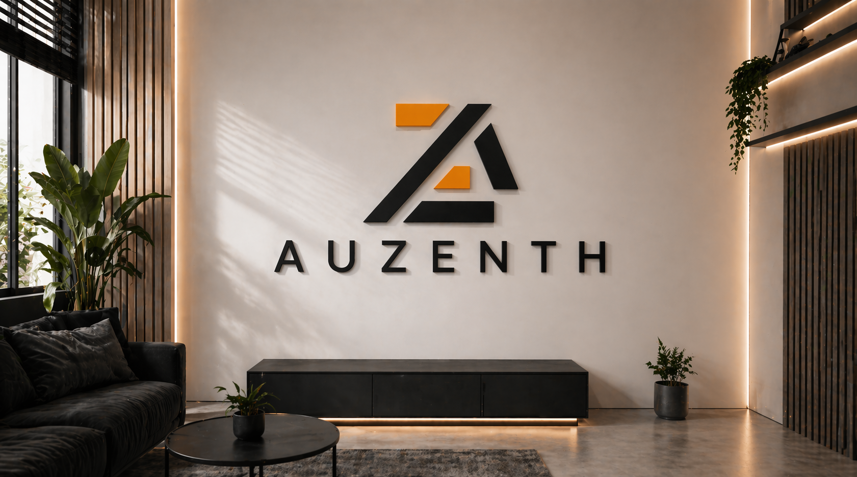
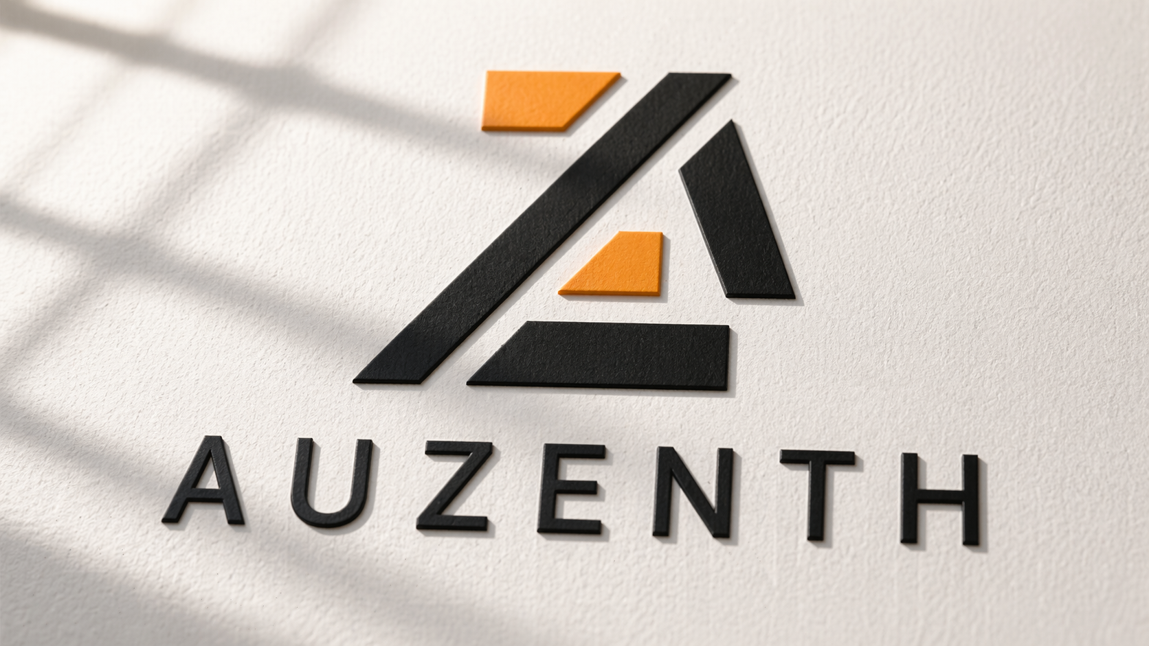
The mark rewards attention: once you see the “A” in the negative space and the “Z” in the stepped offset, you don’t stop seeing it.

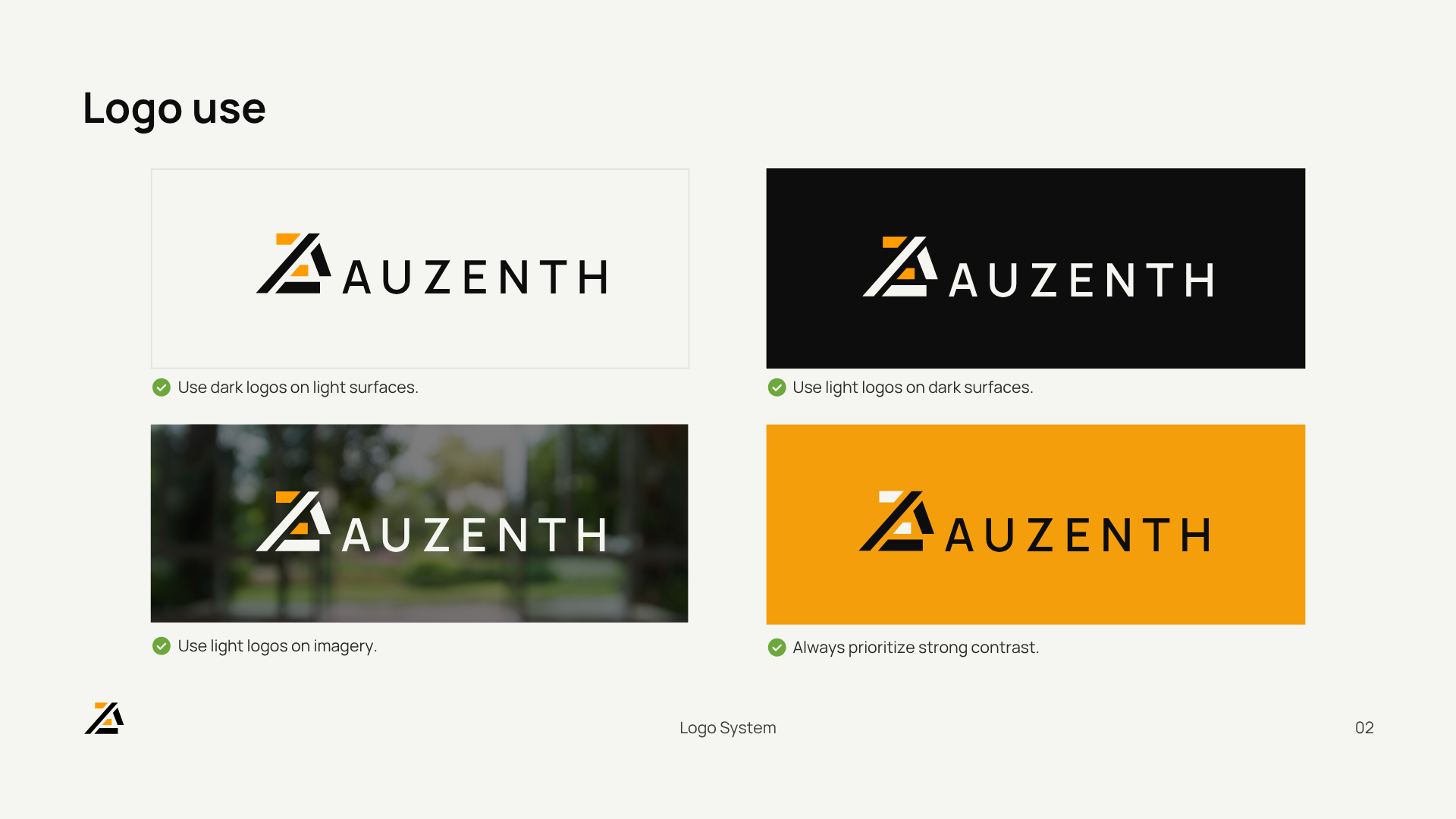
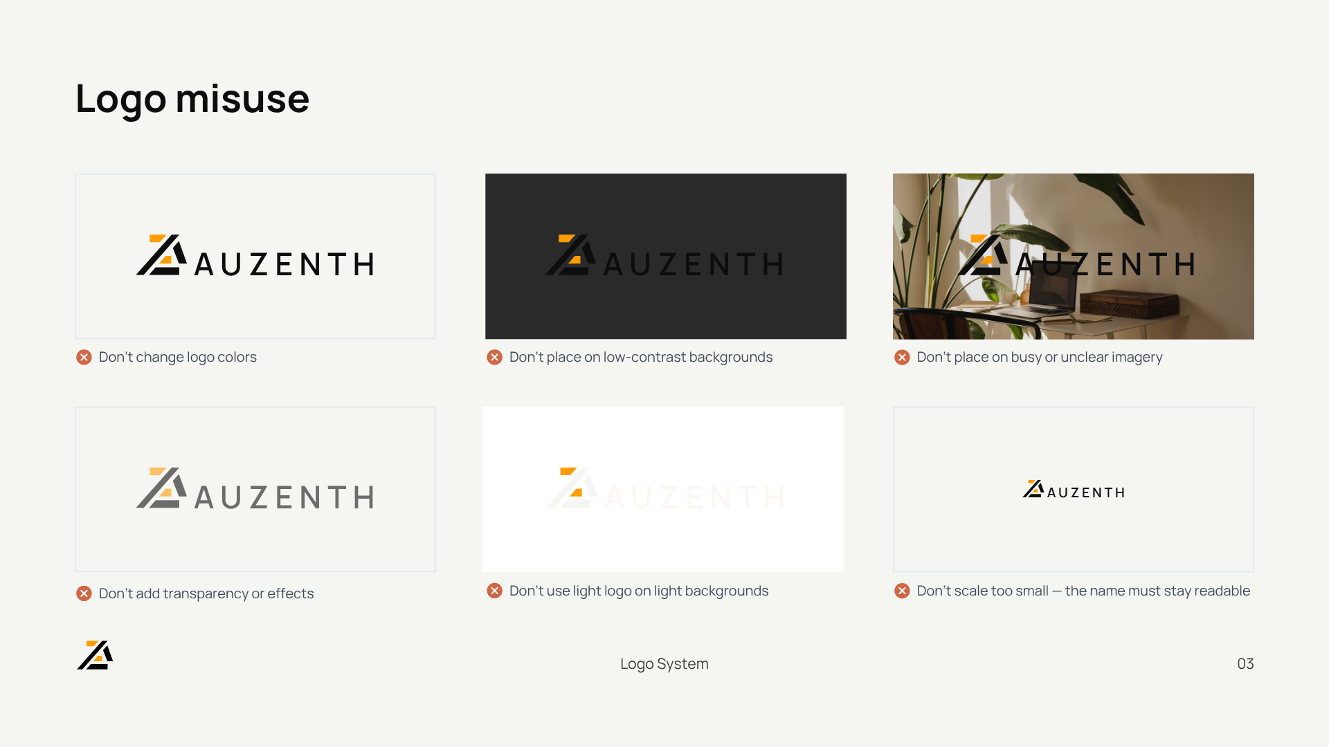
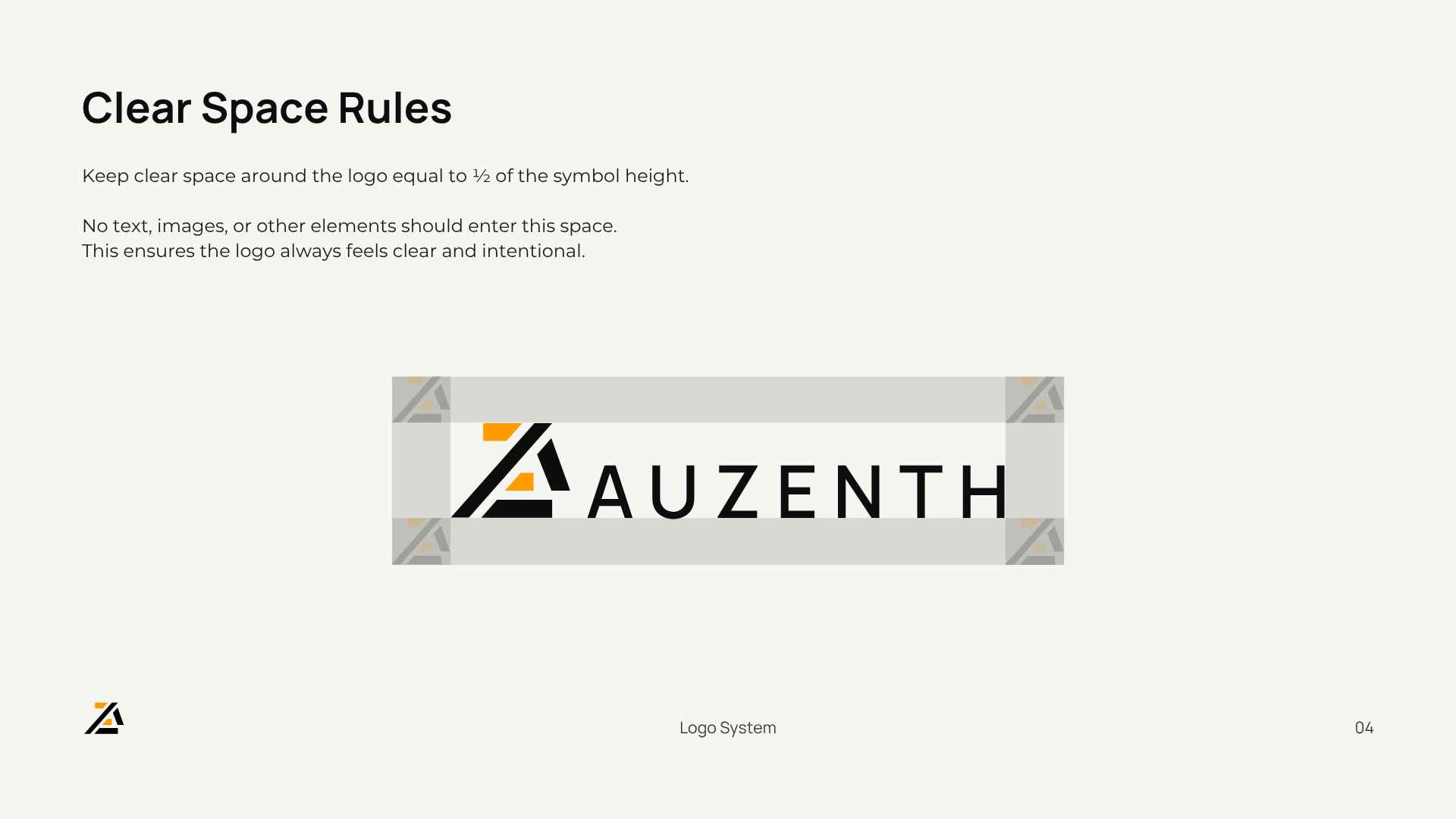
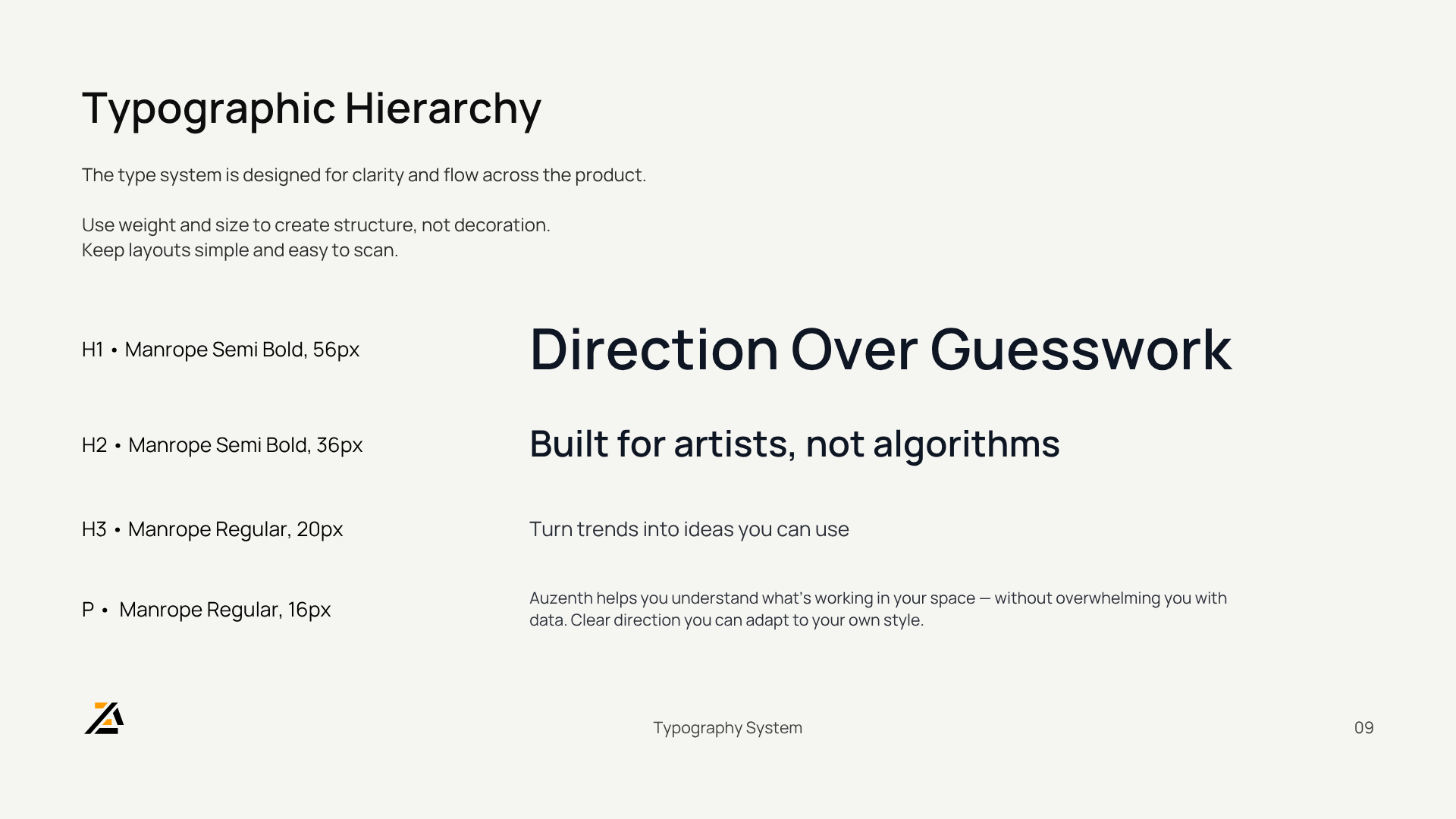
Step 9: Brand Guidelines

A structured system defining how the brand lives across every touchpoint.

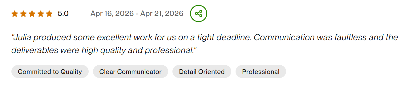
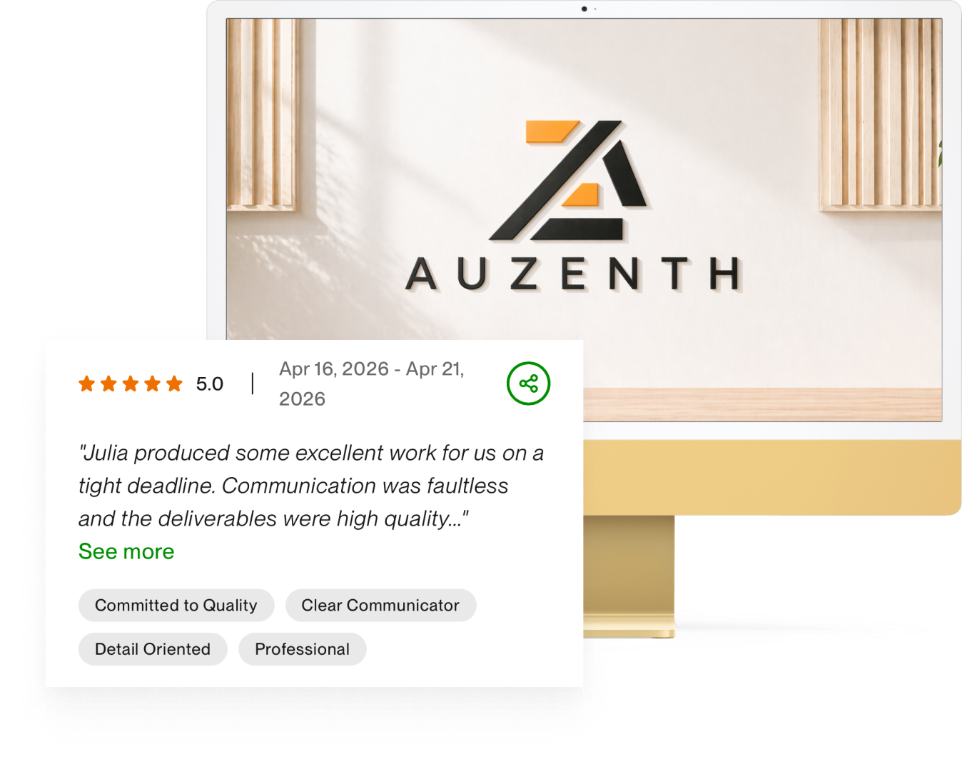
The Result, in Their Words

Relevant Works

Business card

Business card design for partners

Business card

Business card design for partners

Business card

Business card design for partners

Business card

Business card design for partners
Business card

Business card design for partners
Business card

Business card design for partners