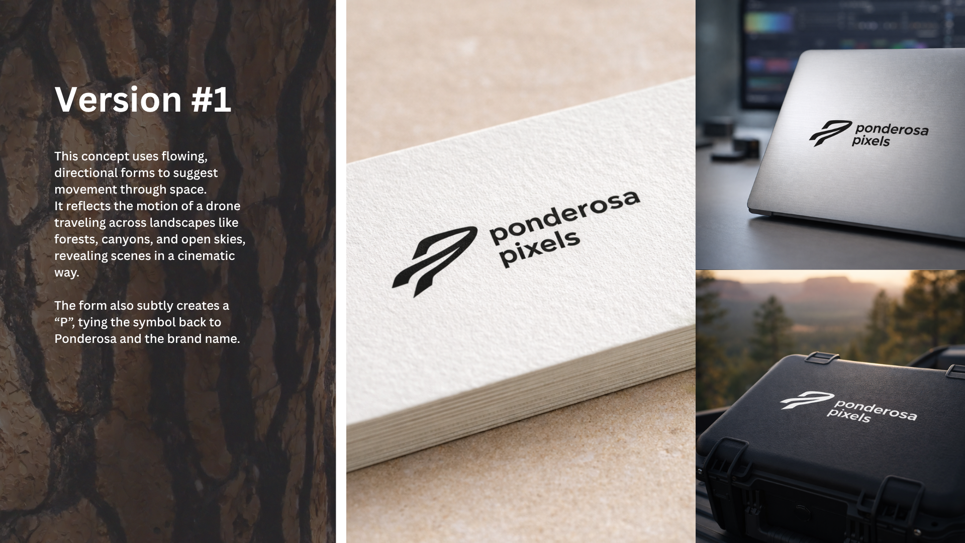
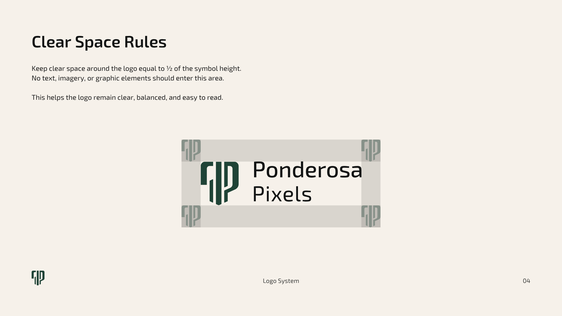
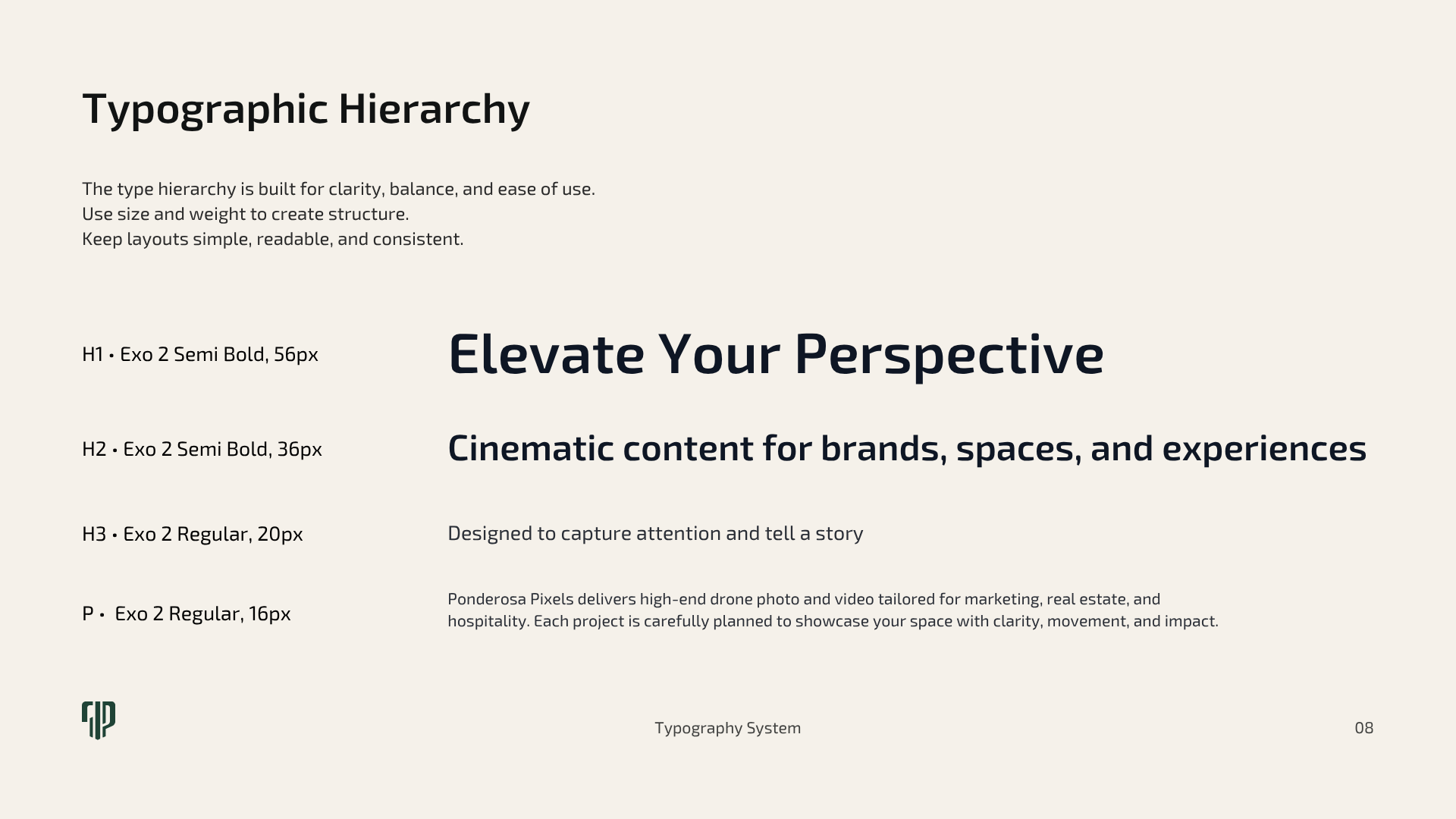
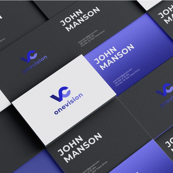
Business card
Business card design for partners
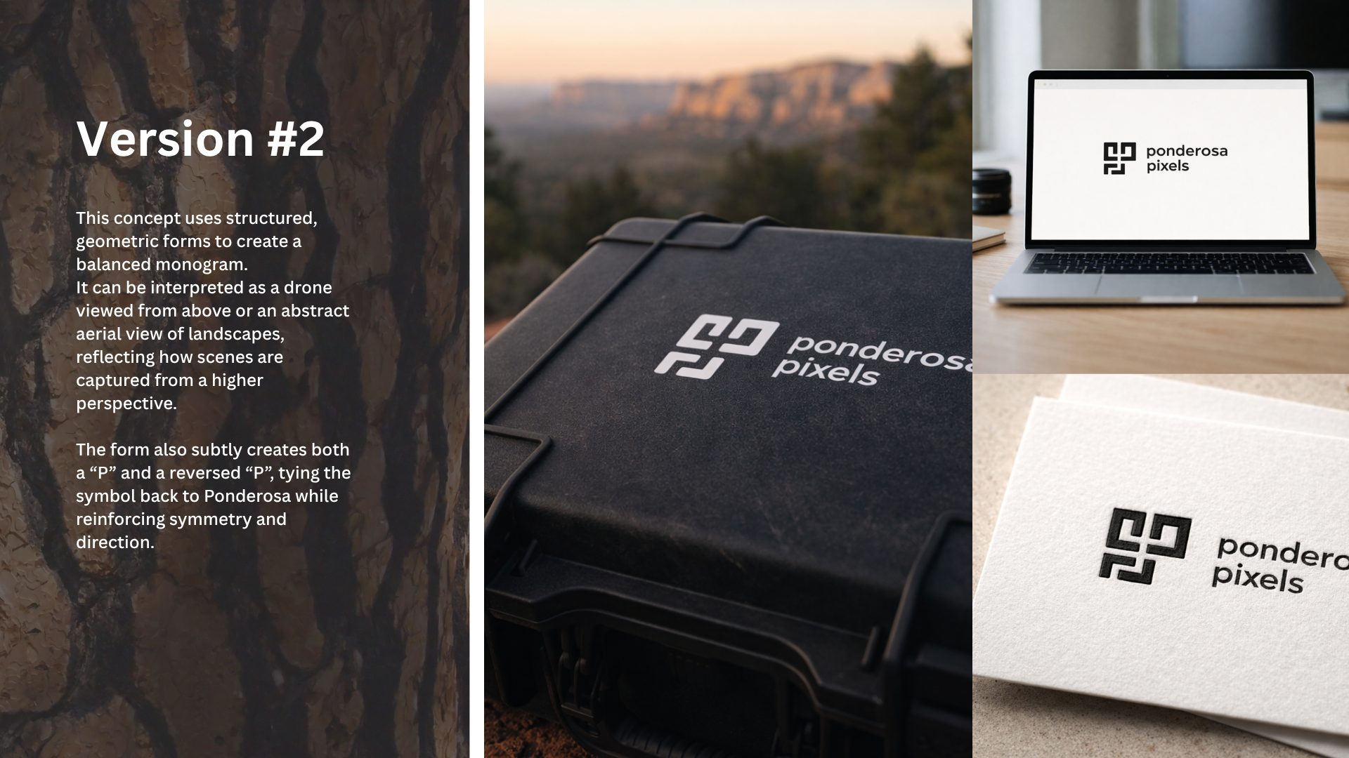
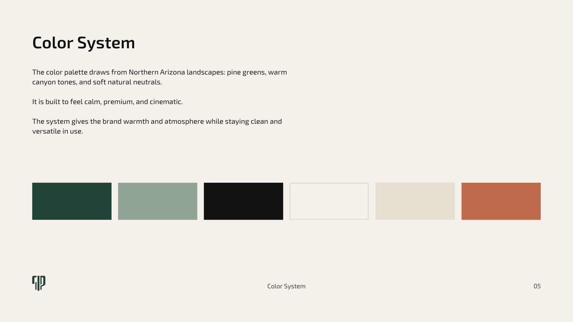
Business card
Business card design for partners
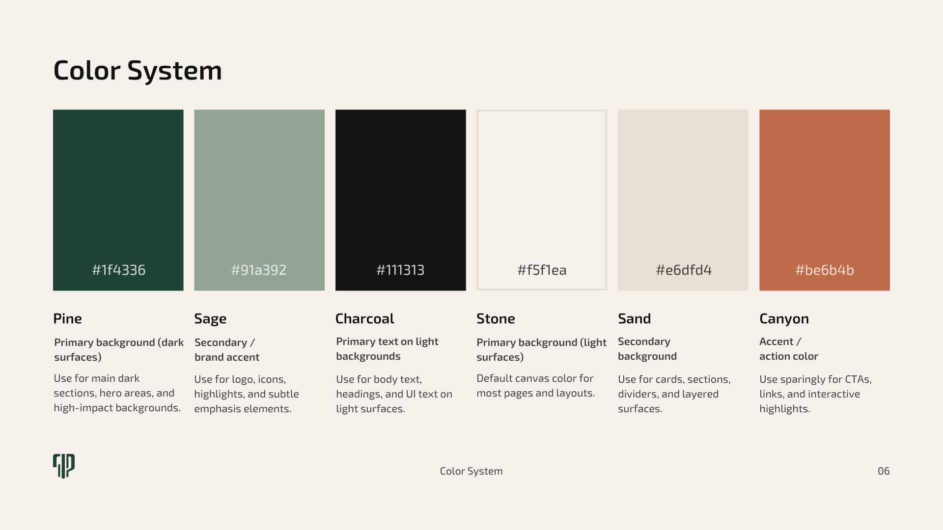
Business card
Business card design for partners
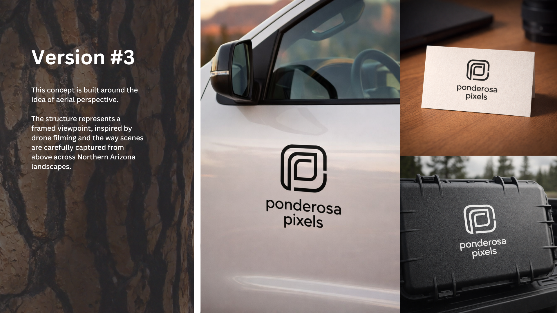
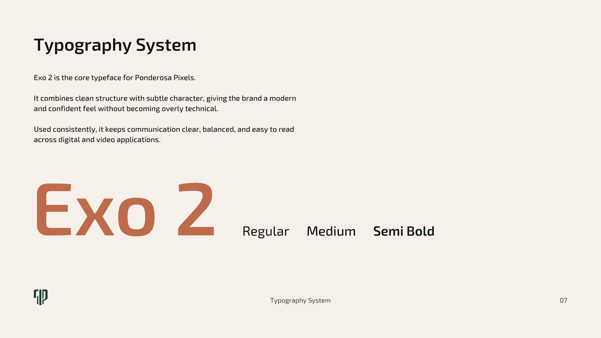
Business card
Business card design for partners
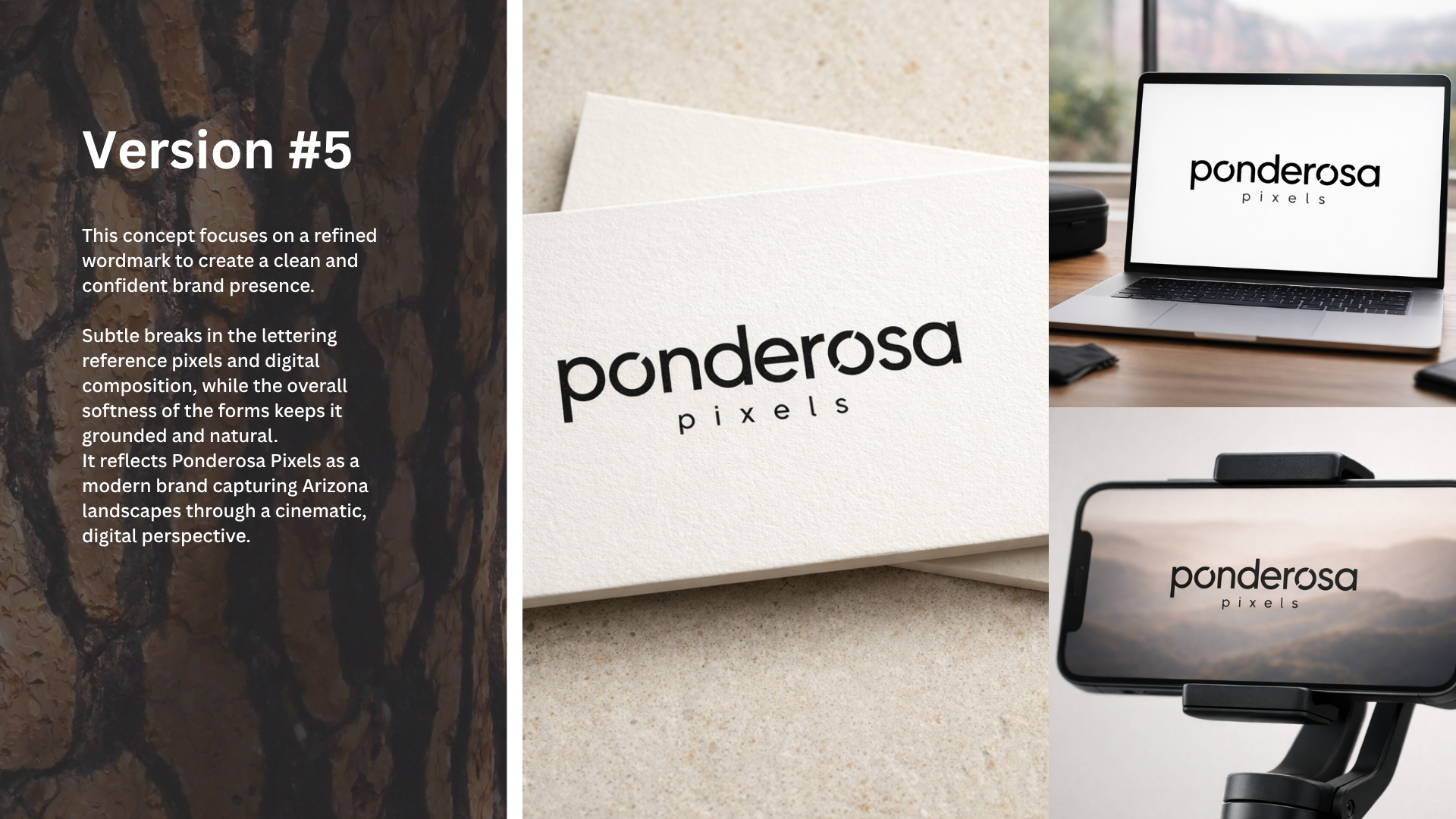
Business card
Business card design for partners
Business card
Business card design for partners